How to Get Rid of Too Much White Space in Microsoft Office 2013? Switch to New Gray Color Themes
When Microsoft Office 2013 was under development and Microsoft released a free Customer Preview version of Office 2013 to public, people started complaining about too much white space in Office 2013 user interface. Actually Microsoft has tried to use Windows 8 style Metro UI in Office 2013 programs, they have removed the Aero glass from Office ribbon, they have removed gradients, etc to provide a minimal look to Office 2013 programs. But many people were having problems with this new white color scheme.
Now the final RTM version of Office 2013 has been released and TechNet and MSDN subscribers must be already enjoying it. If you are not a subscriber, you can download and test a fully functional trial version of Office 2013 RTM version using following link:
Download Free Microsoft Office 2013 Professional Plus 60-Day Trial Version
Advertisement
The good news is that after receiving users feedback about the white UI in Office 2013, Microsoft decided to introduce 2 new themes or color schemes in Office 2013 RTM: Light Gray and Dark Gray.
So now Office 2013 users who don’t like the white interface of Office 2013, can switch to new Gray color themes and can get rid of the white UI.
To apply these new themes, you can follow these simple steps:
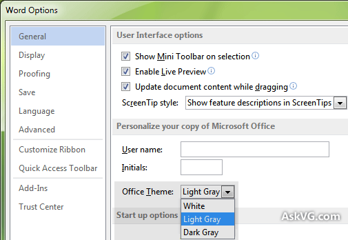
1. Open any Office 2013 program such as Microsoft Word. Now click on File menu present in the ribbon. Then click on Account tab given in left sidebar.
2. It’ll open your Office account settings page. Here you can change Office theme. You’ll find 3 Office themes available:
- White
- Light Gray
- Dark Gray

3. Select your desired theme from the drop-down box and it’ll immediately apply it.
Advertisement
Light Gray Theme in Action:

Dark Gray Theme in Action:

NOTE: Alternatively, you can also apply these new themes using Office Options window as shown in following screenshot:
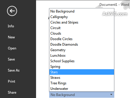
PS: Microsoft has also added a few new background images in Office 2013 RTM version which can be activated only if you are logged in using a Windows Live ID in Office 2013 programs.
Note that if you set the background color to pure black (Design->Page Color) the text automatically flips to white. I think they actually solved the brightness/inversion issue in 2013, although it may remain undocumented.
I used to be a program manager for Microsoft and I fought this “its too bright” battle with the Office UI people, but never got anywhere.
Bought office 2013 almost a year ago, but only recently installed it. All I can say about the new interface is this is the worst most amateur looking interface I have seen in a long time. This reminds me of freeware from the 90s. Even the text representation is poor.
Please give more options in the colour / theme section.
The only people who can’t see this as a step backwards clearly already works for MS.
The themes we get to choose from are unusable, bad and horrible. As a cad user, we know that viewing fine detial in grey on a white background can actually damage your eyesight over time.
I have to use AutoCad and Msoffice, when I swap back and forth, it takes a few seconds before I can see anything (going either direction) like going outside on a snowy sunny day.
Microsoft…. FIX this. You are actiing like Apple…. Telling ME what I supposedly LIKE.
I’ve been on Office 2013 outlook for 2 weeks now and hate it. Like Earl above, I work on AutoCAD, 12D and various other design programs. Have tried AutoCAD with every color combination imaginable and still use black background because it’s the best for CAD work. Going from that to THIS white is like walking into a snowstorm. I keep closing windows cause I can’t see the edges etc etc This is horrible. Setting up an office at home, we won’t be using this interface. I know how to fix all your MS problems….buy an Apple, sorry Earl
I can’t see what are you complaining about, let’s not forget that MS spent a considerable amount of time an money to get the perfect UI that was the most legible and freindly to the users eyes.
I understand for years MS has given us all these vivid colours to play with and use but sometimes limited choices is the best option.
I’ve been using Office 2013 for 18 months and have grown to actually appreciate it’s simplicity. You need to get used to this type of UI as it is the way of the future, Apple are heading down the same path, you only need to look at their latest iTunes.
As computer support, the general user reaction I got when “upgrading” to 2013 was “uggghh barf”. It totally blows my mind how a company like Microsoft can degrade the UI to such an extent.
Microsoft is like Putin – in power and pushing their own agenda versus what the users want. Microsoft just lost Ukraine with Window 8 and Office 2013.
Still not great!
Please MS, hear our pleas & listen to the UI experts – we need more contrast in the UI !!!!!! The new Dk gray is still waaaay tooooo whiiiiiiite! Otherwise I like MS Office 2013 a lot.
Microsoft apparently did ZERO human interface design/testing with this product. I have so many users that just hate it, and some it’s a medical issue. They get migraines after a short period with it.
Horrible, and it’s quite clear they don’t care about it or it would be fixed by now.
I just “upgraded” to Office 2013. Horrible visual design. Even the desktop icons are horrible. Obviously intended for the 2″ screen on a smartphone, with no consideration given to those who might actually be using a laptop or desktop. Nobody at MS gives a damn about the users anymore. I have to assume that equal thought was given to the functionality.
I recall the decline “timesharing”, when the leading company decided that the game was up and their best option was to milk every dollar they could from the customers who couldn’t easily move their applications. They cut services and raised prices, bleeding the customers as best they could and eventually dooming the company to a “professional services” shell. Looks like Microsoft has made a similar decision, and is placing it bets on their cloud-based services at the expense of anyone still using a fat client.
this is the worst “udate” i have ever seen……ridiculous colors to choose from
We (some 2000 users) have recently been upgraded as a first step in a upgrade cycle for our 20.000 users worldwide.
And the first thing which struck us was the “minimalistic” color scheme of all Office applications.
Almost everybody agrees already now: this is such a huge, huge mistake!!! Dark Gray? What dark? We don’t see anything that looks “dark”..
Nobody from the first bunch of 2000 users is happy with this, nobody!
Unfortunately, there is no way back… Indeed, Microsoft is acting completely on its own. This is typical a sign that the end of an age is very close. People will not accept this much longer….
The problem isn’t the white… the problem is the space. #givemebackirc
Try reducing the brightness of the screen. It will make the white look somewhat grey and hopefully should relieve any sore eyes many of you seem to have (including me….)
I have found a fix for all the white in the work space!!! put some celophine over your screen you should be able to get red, yellow, green, blue, i would like a grey but haven’t found an online store that has one i like yet…….. might trying using two different colours and see how that goes!!
The brightness of the screen make us too tired and sore eyes. Please provide some soft color to reduce the brightness and bold the table lines and bar lines.
White, Gray and “Dark” gray?? is this a joke? And no way of customizing?? None of these colors make the retina any less strained from peering into an artificial intense source of light all day
Its really very old type, does seems working with new comer’s company 1995 application. will give 0 rating to this.it will not work. 2010 is better
The suggested “themes” are of no help for the sheer blinding white of the text space of the desktop. I don’t care about the border or menu bar colors. That’s not whats hurting my eyes.
I tried the “high contrast black” theme as I was writing this – Totally useless, it blacked out everything. I couldn’t even see what I was typing here.
The older versions of Windows allowed for endless shades to tone down that white. But windows 8 has few options and all of them are useless for reducing the main back light of the window. I might have to revert to using a tinted piece of mylar or wear sunglasses to resolve the problem.
Thank you everyone for your comments. I’ve been searching the internet trying to find a fix for the Outlook brightness/white space.
I have a question though. At the bottom of the preview pane, it says the person’s name who the email came from, and to the right has squares with blank faces. Is there a way to get rid of that horizontal block of space? I was hoping with the line at the bottom gone I would be able to see more of the email. I have my preivew pane at the halfway mark of the screen and can still only see the first line of the email.
Note: On the view tab, message preview, choosing 2/3 lines does not work. It only shows you more of the header, not the email content
I guess we can go back to using monochrome monitors, huh?
The only fix available for Office 2013 is to switch to High Contrast Black in your personalize Microsoft themes. Once you’ve added that, customize it to suit your needs a little better and make it look less 1985. Make sure you go into Outlooks options and check ‘disable hardware acceleration.’ You will find out there is a heavy downside for your excel program that cause it to not allow colors. The fix for that is having another saved theme under ‘windows classic.’ Make this theme as dark as you require and save it. This new theme won’t be dark enough in Outlook, but you can switch to it when you need Excel.
Just don’t upgrade to Office 365, it’s awful design, boring, tiring on the eyes, unclear. Simple things like in Outlook when you have messages in an inbox or folder, it only shows a vague blue number behind it indicating there is mail rather as the old system to make the box bold. I know, what a small difference, but it’s all these things that make the new look boring, not clear, confusing, what a step backward in terms of design, back to the days where you only had LCD monochrome days!
I wonder who will be coming out with a Braille version of MS Office when we all go blind from this interface. Too much white. My squint lines are visibly deeper around my eyes and I am getting headaches. We just moved to Office 365 (over 120 users) and I wish I could roll back to 2007. Microsoft, please help?
This is horrible! I need contrast that has some level of identifying what I am seeing. Grey and white. This is going back to the old computer screens of green and black.
The color schemes are misnamed.
They should be “White”, “Almost White”, and “Very Light Gray”.
I thought this article was satirical about being able to change from grey to grey.
Windows 10 and the new office and development suites are all grey, grey, grey and I shall be downgrading back to windows 7 and Visual Studio 2010 as soon as I can. I had already seen Office 2013, couldn’t read the text and I have avoided it, so that doesn’t need downgrading.
Amazingly, it isn’t.
@kotetsu
“If you hate it, don’t freaking use it! No one’s forcing you to use Microsoft Office.”
Um, yes they are, our employers force it on us. You are an arrogant shill for MS.
Agree with Raargh.
My employer (a very large aerospace company) has made Office 2013 standard company-wide. So I have no choice but to use it for 8 hours a day. I thought it was just me not liking the visuals, but I see that I am only one among many.
At least on my personal computer at home I have a choice and I will choose not to upgrade to Office 2013.
We just upgraded to Windows 10 POS and Office 2016 from Win 7/Office 2007 and everybody in this office is complaining about how the background is too light. We don’t have the option of light grey or dark grey. Windows 10 POS only has WHITE and COLORFUL. There are 21 people in my office. POS= Piece Of Sh?t